

The number of people using mobile devices has been increasing for the last decade. Almost every other person uses a smartphone these days and they use it for surfing the web and researching various websites and the pages within them. Therefore, it has become necessary for people to create websites which are optimized for mobile search traffic. They need to make sure to use the tools and techniques to make the websites, mobile friendly or else they might not be able to get a higher Google ranking for their site.
What is mobile website design?
Mobile website design means that the website is properly optimized to be viewed on any screen of any size. The site should fit the screen of any device properly so that reading the information becomes easy and clear. The users should not have to use the zoom option on the screen all the time or else they will not be interested anymore.
Before optimizing the websites for mobile devices, it is important to know about the visitors on the website, how they use the site, what device they use the most, get feedback from the visitors, etc. The site should load quickly and should have a better interface so that everything important is easily trackable and it should also have comfortable aesthetics without too much stimulation in one single place.
Steps to consider while optimizing the website for mobile searching
Now that is clear that having a mobile-optimized site is very important to make it successful and popular among viewers and visitors, one needs to follow certain considerations clearly as well.
There are some ways that can be used to improve the website and to keep a check on its performance. The points to keep in mind are:
- Use a responsive website theme
When one is creating a website using WordPress, they need to pick a theme that is responsive and works well on all kinds of devices. It should not have any kind of negative effect on website optimization and performance. It should be easily customizable with great, comfortable visuals. Always choose responsive designs by filtering them from the lot and read the descriptions carefully. It is possible to preview how they will look on all devices prior to installation.
- Use a good website host service
Using the right hosting plan and service is very crucial when it comes to the performance of the website in term of speed and loading. To make sure that the website does not face too much downtime and that it performs well on all devices, especially mobile phones, a web host with better resources and speed needs to be chosen. One should keep the security and safety of the website in mind as well or there can be a hacked website. It is crucial to use a dedicated server for the websites so that there is no downtime, also so that it has optimized speed at times and offers complete control over the safety as well.
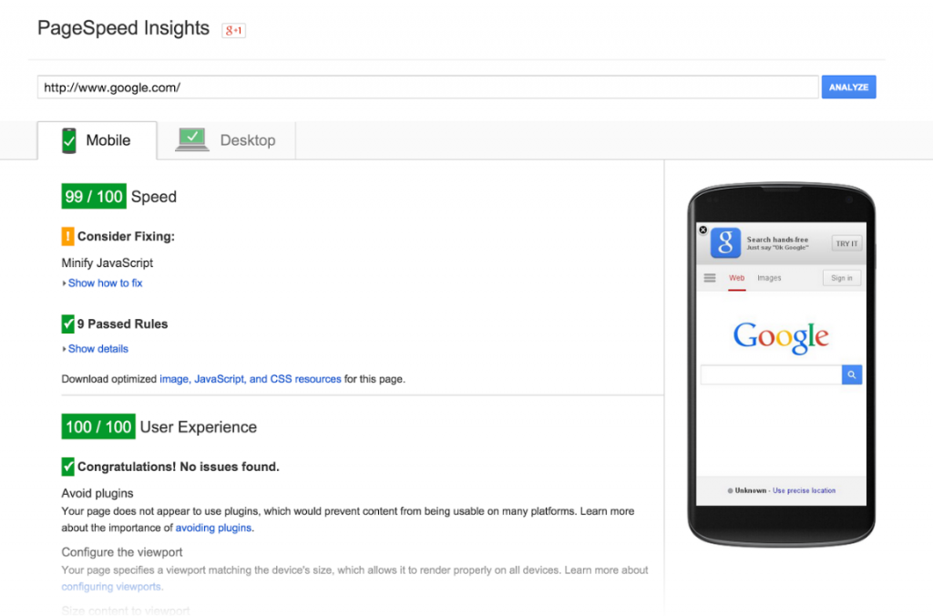
- Use Google’s mobile-friendly tool to test the website
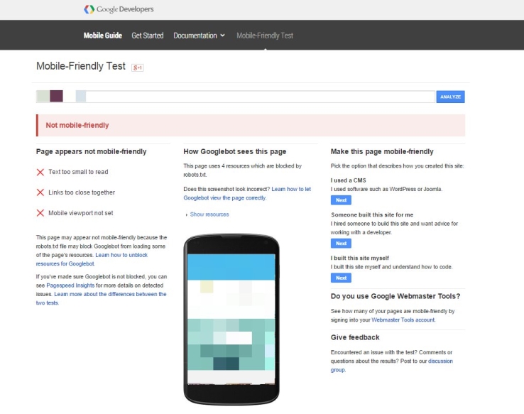
One can either simply use the website on different devices by themselves to check how they are faring in terms of performance, navigation, usability, etc. or a dedicated mobile testing tool can be used to check the optimization of the website even more deeply. The links can be entered for the website on the tool and run to test the mobile friendliness. This will show how the website looks on a mobile screen, along with certain comments which are to be checked and corrected. We did some work with an adult dating app company and making changes and checking them through this tool allowed us to improve mobile optimization greatly. This particular hookup sex website quickly started ranking higher than other dating and hookup sites. The changes were relatively small in the grand scheme of web design, but they had a drastic impact.
- Quick loading website
People usually hate those websites which do not load quickly and tend to lose their patience and stop using it entirely. Users need to make sure that the speed of the website is optimized and speedy at all times to make sure that they can have a good experience and also that there are minimum bounce rates. Speed test tools can be utilized to check the minimum speed of the loading. Some of the techniques that can help in these loading times are:
- by using content delivery network servers
- by using caching techniques
- through optimizing the website code
- by compressing the pictures and images on the website
- By keeping the website up-to-date, all the time
- Redesign the pop-ups
Pop-ups are one of the most effective ways of marketing and remains the best way to gain the attention of the user. They can be used to relay information to the user or to increase the conversion rates. One can use the pops ups which are strategically designed for mobile screens to minimize user experience disruption and to avoid any kind of Google pop-up penalties. Following the guidelines by Google can help the user to restructure the pop-ups effectively.
People accessing the internet and browsing websites via their smart devices will only continue to grow and become more widespread throughout the world. When it comes to designing and developing a website this factor must be considered. Mobile friendly aesthetics and functions have far reaching implications for ranking in search engines and it seems like that will continue to gain weight as a factor in determining rank for given search queries as users continue to access the internet through mobile devices.